
Pages
A template has three pages: Auth, Profile, and Workflow. Each page mounts the login box into a mandatory container <div> that you keep in your HTML. You control everything around that container, while the login box inside is styled through Styles.
Page structure
Every template has three page groups, and each group holds the same set of parts: HTML, BeforeScript, CustomCss, CustomJS, and HeadTags. The Authentication group is expanded below to show what each part does.
<head>, such as meta tags, fonts, or third-party scripts.Auth page
The Auth page is a centralized authentication portal you can direct users to for common identity use cases, including login, registration, and password recovery. Customize the surrounding page with HTML, CSS, and JS, and use Styles and CSS classes for the login box.
<div class="container">
  <div id="auth-container"></div> <!-- Mandatory container -->
</div>
Profile page
The Profile page is a post-authentication page that handles profile activities, including viewing and updating profile information, consent and privacy requests, and account management. Use CSS variables to match the surrounding elements to the login box.
<div class="profile-editor-container">
  <div id="auth-container"></div> <!-- Mandatory container -->
</div>
Workflow page
The Workflow page handles special steps in the user journey, such as custom processes or flows defined in Identity Orchestration. It renders whenever you run a workflow configured there. Adjust the layout around the workflow form in HTML (keeping the mandatory <div>), or change the flow in the Before Script.
<div class="profile-editor-container">
  <div id="workflow-container"></div> <!-- Mandatory container -->
</div>
How an Auth Studio page renders
Auth Studio pages are server-rendered. The SDK runtime (LoginRadiusV3.js) and its stylesheet are already included in the page, and the Before Script creates the SDK instance for you, so you do not install, import, or bundle anything.
When a user requests the page, the server returns an HTML page that already contains the SDK, the Before Script, and your custom code. In the browser, the Before Script runs first and creates the SDK, which then hydrates the empty containers with the right flow. Your CustomCSS and CustomJS load afterward and skin the result.
Each of the four code fields plugs into a stage of this flow:
| Field | Runs | Use it for |
|---|---|---|
| HTML | Server-rendered | The page shell around the login box, such as headers, footers, backgrounds, and marketing copy. Must keep the mandatory container <div>. |
| Before Script | Before the SDK initializes | Reading URL parameters, setting SDK options on commonoptions, feature flags, and early consent context. |
| CustomCSS | After the Before Script | Page-wide styles and layout overrides for the hydrated login box. |
| CustomJS | After the login box mounts | Analytics, consent banners, and DOM changes outside the login box. |
Enterprise use case
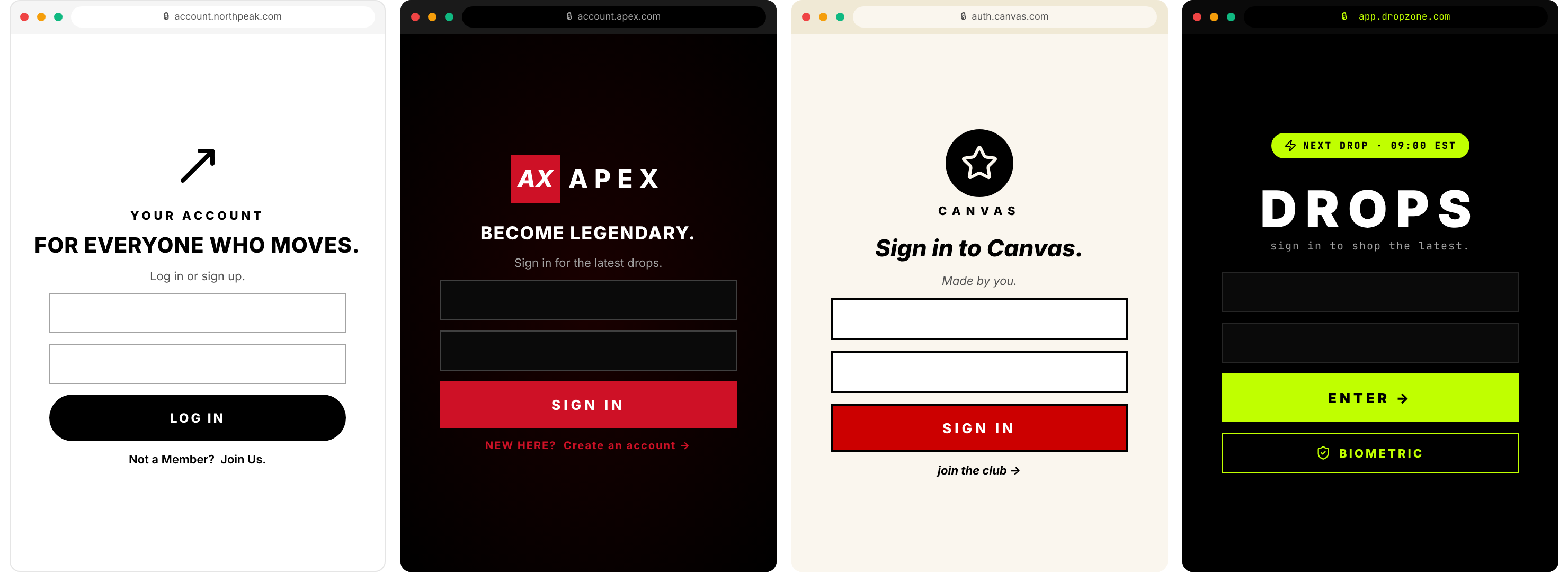
Editing the page code lets you change the entire look and feel of a template, not just its colors. Large organizations use this to run many brands across regions and campaigns, each with its own template and heavily customized pages.
Apply styles in code
Every style property is exposed as a CSS variable. The template's default CSS consumes those variables with fallbacks, so branding you set in the Style editor flows through automatically. To go further, you have two options.
Extend with CustomCSS. Reference the same variables in your own selectors so custom elements stay in sync with the login box. Target the login box with its CSS classes:
.loginradius-button-container button {
  background-color: var(--sdk-button-primary-bg-color);
  color: var(--sdk-button-primary-text-color);
  border-radius: var(--sdk-button-primary-radius);
}
Match the surrounding page in HTML. Use the variables in the page HTML around the mandatory container so your header, background, and copy stay consistent with the login box:
<div style="background-color: var(--page-background);">
  <h1 style="color: var(--sdk-card-text-color);">Welcome</h1>
  <div id="auth-container"></div> <!-- Mandatory container -->
</div>
For the full set of login-box CSS classes, see SDK Customization.
View theme CSS
The template's default theme CSS consumes the style variables, each with a fallback value. This is what ships by default, and it shows which variables the theme reads:
body {
  font-family: var(--sdk-font-family, system-ui, -apple-system, sans-serif);
  margin: 0;
  background: var(--page-background, #f5f5f5) no-repeat center center / cover;
}
.container {
  display: flex;
  justify-content: center;
  align-items: center;
  margin: 0 auto;
  height: 100%;
  min-height: 100vh;
}
#profile-editor-container {
  min-height: inherit;
}
h1 {
  color: var(--sdk-card-text-color, #333);
  font-size: 24px;
  margin-bottom: 20px;
}
.toggle-link a {
  color: var(--sdk-link-text-color, #3b82f6);
  text-decoration: none;
  cursor: pointer;
}
CSS variables
Every Style property maps to a CSS variable you can reference in CustomCSS or in your page HTML. The variables are grouped by area. The value shown on each line is an example default.
Logo
/* Show or hide the logo */
--sdk-show-logo: true;
/* Logo image URL */
--sdk-logo-url: "https://example.com/logo.png";
Background
/* Page background color */
--page-background: #f0f0f0;
Typography
/* Font family */
--sdk-font-family: "Arial, sans-serif";
/* Text alignment */
--sdk-text-align: center;
/* Header font size and weight */
--sdk-header-font-size: 24px;
--sdk-header-font-weight: 700;
/* Subheader font size and weight */
--sdk-subheader-font-size: 18px;
--sdk-subheader-font-weight: 500;
Card
/* Hover / brand primary color */
--sdk-brand-primary-color: #007bff;
/* Text colors */
--sdk-card-text-color: #333;
--sdk-card-subtext-color: #666;
/* Background color */
--sdk-card-bg-color: #ffffff;
/* Width */
--sdk-card-width: 400px;
/* Padding (top, right, bottom, left) */
--sdk-card-padding-top: 20px;
--sdk-card-padding-right: 20px;
--sdk-card-padding-bottom: 20px;
--sdk-card-padding-left: 20px;
/* Box shadow */
--sdk-card-box-shadow: 0 2px 4px rgba(0,0,0,0.1);
/* Border radius (per corner) */
--sdk-card-border-radius-top-left: 8px;
--sdk-card-border-radius-top-right: 8px;
--sdk-card-border-radius-bottom-left: 8px;
--sdk-card-border-radius-bottom-right: 8px;
/* Border width (per side) */
--sdk-card-border-top-width: 1px;
--sdk-card-border-right-width: 1px;
--sdk-card-border-bottom-width: 1px;
--sdk-card-border-left-width: 1px;
/* Border color */
--sdk-card-border-color: #ccc;
Primary button
/* Background and text color */
--sdk-button-primary-bg-color: #007bff;
--sdk-button-primary-text-color: #ffffff;
/* Border color and radius */
--sdk-button-primary-border-color: #0056b3;
--sdk-button-primary-radius: 4px;
/* Box shadow */
--sdk-button-primary-shadow: 0 1px 3px rgba(0,0,0,0.2);
Secondary button
/* Background and text color */
--sdk-button-secondary-bg-color: #6c757d;
--sdk-button-secondary-text-color: #ffffff;
/* Border color and radius */
--sdk-button-secondary-border-color: #545b62;
--sdk-button-secondary-radius: 4px;
/* Box shadow */
--sdk-button-secondary-shadow: 0 1px 3px rgba(0,0,0,0.2);
Input fields
/* Background, text, and border colors */
--sdk-input-bg-color: #ffffff;
--sdk-input-text-color: #333;
--sdk-input-border-color: #ccc;
Links
/* Text color and font weight */
--sdk-link-text-color: #007bff;
--sdk-link-font-weight: 500;
Social
/* Layout */
--sdk-social-layout: horizontal;
/* Colors */
--sdk-social-bg-color: #ffffff;
--sdk-social-text-color: #333;
--sdk-social-border-color: #ccc;
/* Border radius and box shadow */
--sdk-social-border-radius: 4px;
--sdk-social-box-shadow: 0 1px 3px rgba(0,0,0,0.1);
/* Show the icon only, without the label */
--sdk-social-icon-only: true;
Footer
/* Background and text color */
--sdk-footer-bg-color: #f8f9fa;
--sdk-footer-text-color: #333;
/* Top border */
--sdk-footer-border-top: 1px solid #ccc;
Additional
/* Brand primary ring color (focus states) */
--sdk-brand-primary-ring-color: #007bff;
/* Favicon URL */
--sdk-favicon-url: "https://example.com/favicon.ico";
Localization in code
Most translation work is done in the Localization editor. You can also set translations from code in the Before Script with the localizationConfig option, which is useful when you load copy from your own source. Set it on commonoptions before the SDK is created:
commonoptions.localizationConfig = {
  login: {
    title: "Connexion",
    description: "Veuillez saisir vos identifiants pour vous connecter.",
    emailLabel: "Courriel",
    passwordLabel: "Mot de passe",
    buttonText: "Se connecter",
    forgotPassword: "Mot de passe oublié ?",
  },
};

// The default Before Script then creates the SDK with your overrides:
var LRObject = new LoginRadiusSDK(commonoptions);
Provide only the keys you want to override, and every other string falls back to the built-in translation. Each screen is keyed by name (login, registration, email-otp, and so on). For the full key set, validation and error messages, and email/SMS/CAPTCHA language, see SDK Localization.
Advanced customization
To customize behavior, set your options on commonoptions before the SDK instance is created. The default Before Script then creates and initializes it.
commonoptions accepts the same configuration as the SDK's options object. The references below cover the rest. Each SDK reference includes an Auth Studio – Before Script tab, opened by the links in the table, that shows the Auth Studio equivalent, so you can apply the same options without leaving the editor.
| Reference | What it covers |
|---|---|
| Options reference | Every option you can set on commonoptions in the Before Script. |
| Get started with the JavaScript SDK | How the script (CDN) runtime loads and initializes. |
| SDK Customization | Loading indicators, success and error messages, resend cooldowns, and CSS classes. |
| SDK Localization | Programmatic translations, validation and error messages, and email/SMS/CAPTCHA language. |